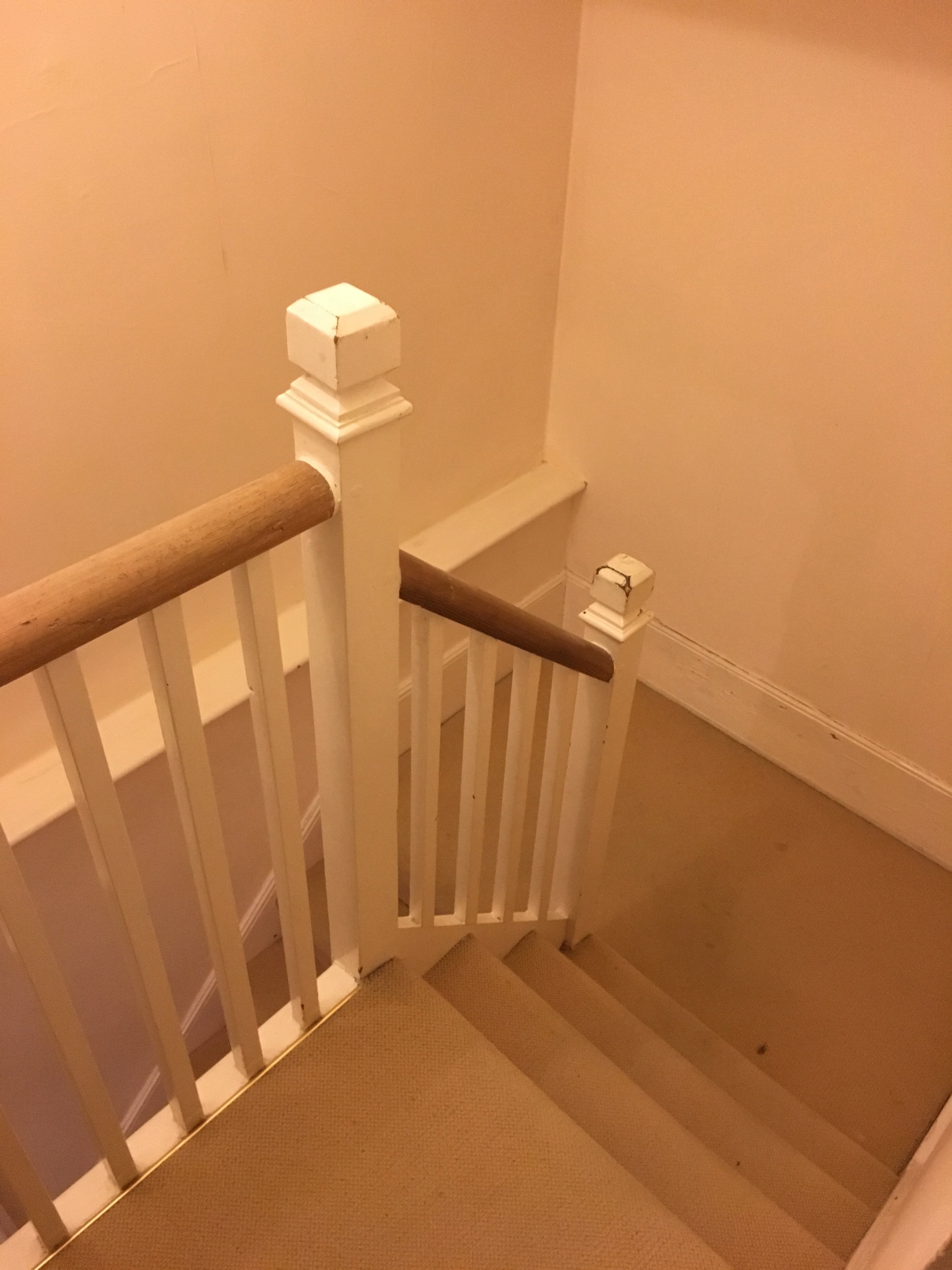
How To Give Your Hallway The Wow Factor

Obviously the above image, doesn't have the wow factor but the aim is for it to make a big impression. It will at become our main entrance as the real front door is there and it will be an introduction to the rest of the house interior design; I want to put our stamp on it as soon as we can. It's got to be curated but fun and have lots of personality!
Our hallway is quite light, and has dramatic arched windows, as well as a mid-way landing. There is a lot of blank canvas to work with and it sparked a few ideas that I really wanted to take on as part of the renovation. Hopefully there is something here that might inspire you too, as I believe these could make a bit impact!
1. Create A Family Gallery Wall
My nanny had a straight staircase up to the first floor with a wall on the right hand side. Above the banister on this wall were her favourite photographs of us all; grandchildren, children, brother's and sister's posing at special occasions or candid snaps of a family barbecue. As kids, my cousin's and I would race up and down the stairs spotting ourselves in the shots and I have such great memories about that staircase, which is why I want to bring an element of that into Number One.
You could create a theme for your wall by just using black and white images, or all images in the same size and with matching frames. Or just be more organic with it and add more and more images as you take them, creating your story as you move up the stairs.
2. A Dark Staircase
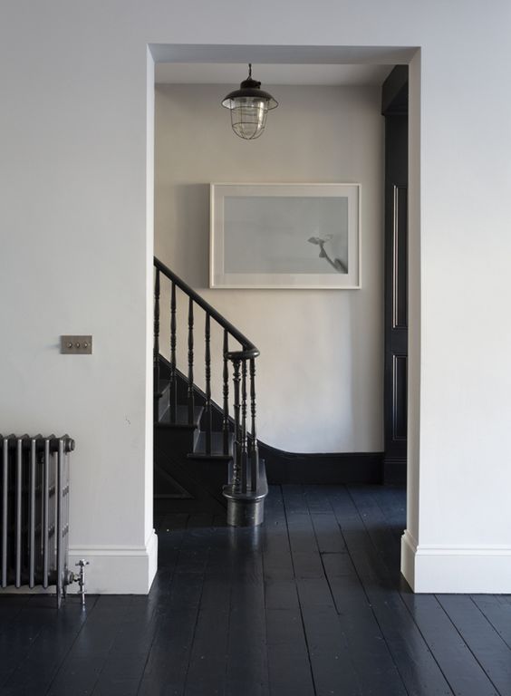
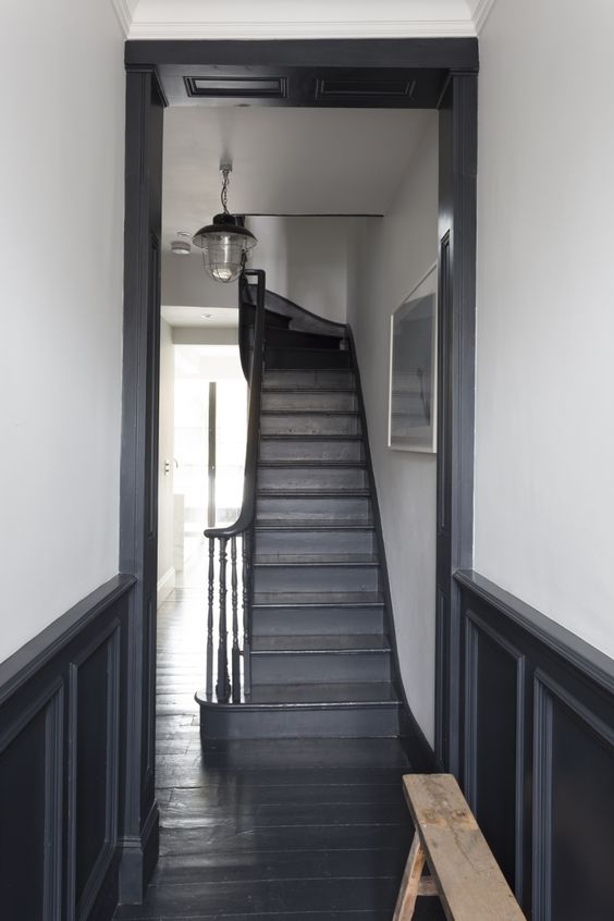
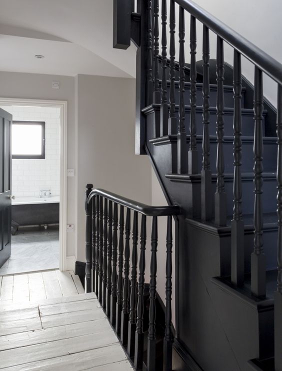
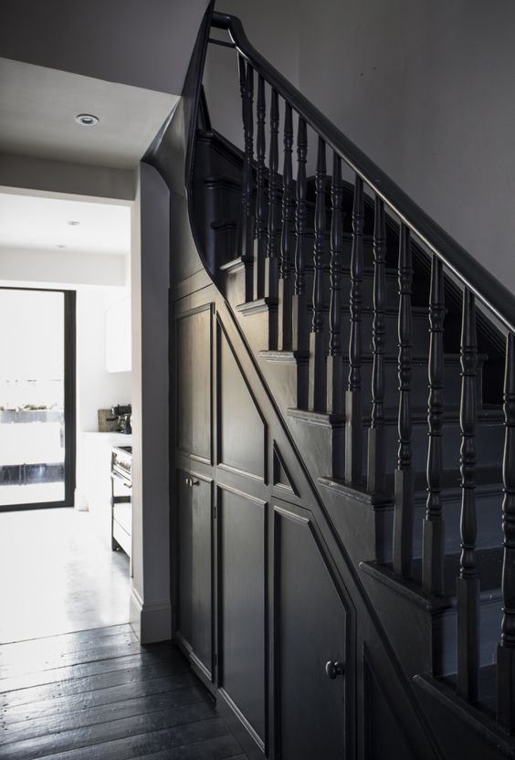
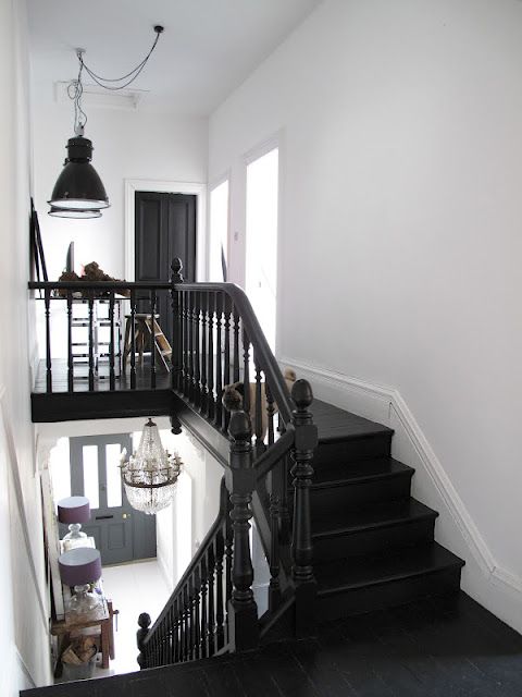
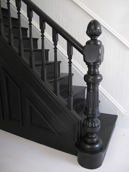
How about painting the floor and the stairs in the same colour? Dark colours against white walls looks polished yet dramatic and really emphasises the feature of having a staircase. It would look particularly juxtaposed on an original staircase with beautiful bannisters, pulling them out from a white backdrop like the images here. I plan on doing this in our space, although I am not sure if I am brave enough for full black although I am lusting after this staircase at 47 Park Ave. The actual dream.
3. Unusual Lighting
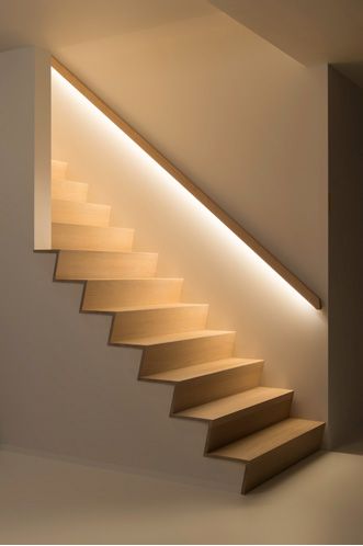
You could consider upping the ante with some cool light fixtures on the ceiling, or go even more rogue by putting strip lighting under the bannisters like the image below. I kinda love the idea of a traditional looking staircase all lit up, showing off it's features.
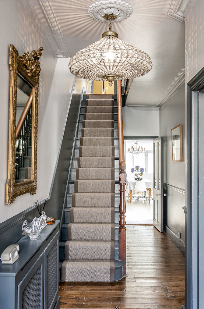
Alternatively you could add a long hanging light on the upper hallway, especially if it's positioned over the staircase or an statement light on the lower landing as shown in the image below. If the fitting isn't in the right position to hang down into the stairwell, don't be afraid to get a spider light and hook up the wires in the positions you want to create something bespoke.
Now, I wanted to share our hallway before's as part of this post so get ready for some of the worse photos you've ever seen; to say they were taken very quickly with very little preparation would be an understatement. Apologies, I will get better picture's as time goes on!
Taken with the real front door behind me, with the two arched windows over the staircase.
Mid-landing taken from the first floor.
As we had to get the damp work done all the carpets had to be pulled up and I felt like it was a good excuse to spruce the space up! It already had a white staircase, wooden bannisters and carpeted steps, and was liveable although didn't have the wow factor.
Half a window...ain't nothing pretty about that.
On the first floor there is a really weird quirk of the house; half a window. I've guess that it is due to an extension of the bathroom as the other two thirds of the frame are on the other side of the stud wall above the toilet.
It's odd, and I have no idea what to do with it so ideas are very welcome! I'm a big fan of Pinterest so I am hoping to find some more ideas there. If you are interested in more of my pinned ideas check out my board Walls, Doors, Stairs & Floors for the ideas I have seen so far for the hallway; I'd love to find some more pinners to follow so please comment on the Facebook page with the link to your Pinterest so I can follow you!
I’m Lucianne, a creative designer specialising in website design, branding, marketing collateral for businesses large and small particularly within the retail sector. I also love to work with brides and grooms-to-be on their wedding branding, websites, invitations and more.
I help businesses grow using a personalised, hands-on approach to your brand identity and design requirements.


