Bathroom: Before & After

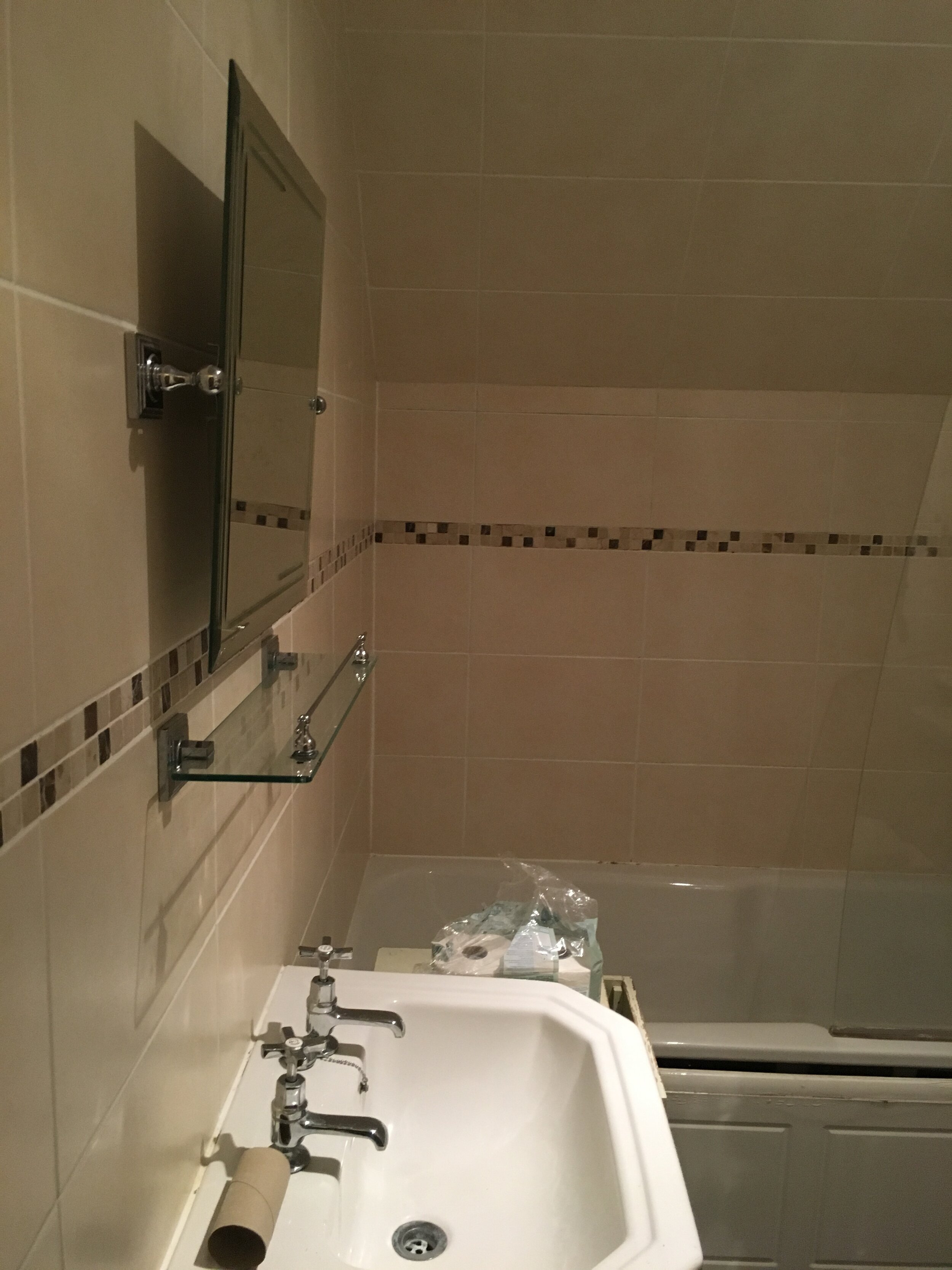
When we bought Number One, the main bathroom was ‘fine’. At least it was, until we started to use it and nothing would drain properly, sink wasn’t fixed to the wall securely and the toilet wasn’t bolted down causing it to move with every use…not fine. Not fine at all.
After finishing the wet room under the stairs, we began to use it more than the main bathroom and realised it was because the main bathroom was so bad. We had somewhere great wash now, so decided to finally sort out the family bathroom. No rest for the wicked and all that! It was back to the drawing board to source bathroom tiles, shower and more matte black fixtures and fittings…
Anyway, here’s what we started with:
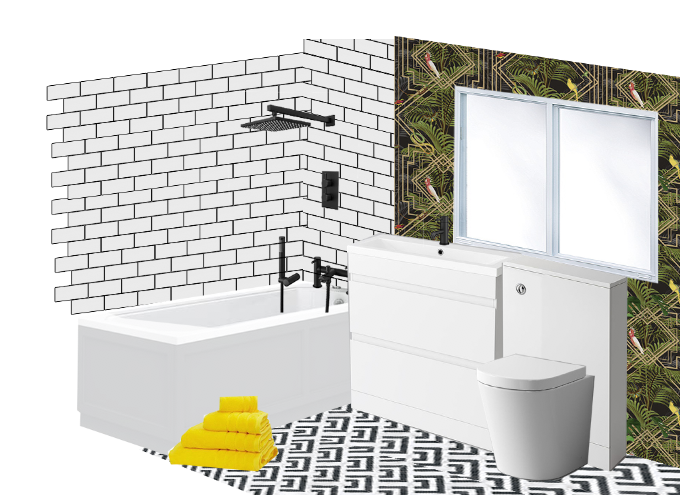
The moodboard
The Inspiration
I absolutely love our wet room, so I wanted to keep the black and white colour palette with yellow towels that could be used upstairs or downstairs.
Top tip: if you keep the colour palette neutral, you can change the highlight colours through towels and bath mats AND it doesn’t matter which towels get left in which bathroom…they’ll all look good!
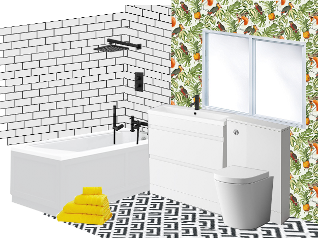
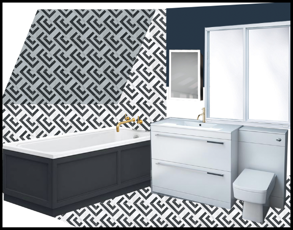
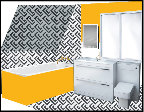
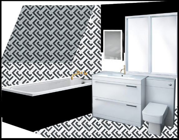
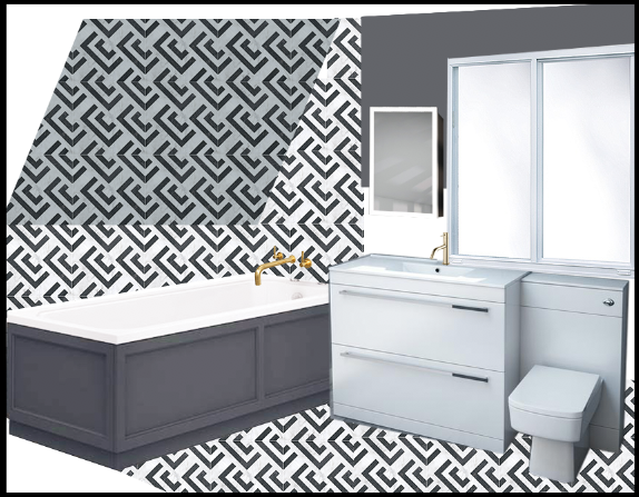
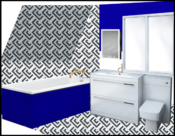
However, I did have an experiment mocking up the room on Photoshop to see how vairous tiles, paint colours and wallpapers would look.
After seeing these, I decided I preferred all white with white metro tiles and black grout.
Spend vs Save
When we looked at the bathroom with our builder, he noted that our current tub was a good one which meant we wouldn’t have to spend out on something new. It’s perfect for the space too, so why change something if it ain’t broke?
Speaking of broke…the pipework was a blummin’ nightmare! The bath wouldn’t drain and there were leaks causing damp patches on the ceiling in the room below. The builder started off by rectifying these faults, including have to sorting out the pipework on the outside of the house, changing it from going uphill instead of downhill. No wonder, the bath wouldn’t drain! Spending the time and money to fix the pipework meant no further damage to the inside or outside of the house. We’ve also ensured that any future surveys of the house will not note this as an issue, making the house ore saleable.
One other area I would recommend spending time/money on is getting a good builder/tilers to work into the corners of the room, especially when you are creating a striking pattern with tile and grout. This means the result should be clean, aligned and balanced sized tiles across the board. ur builder noted that people sometimes shortcut the tiling which can result is uneven shaped tiles and crowded corners.
Saving Tips
I shopped for the majority of the furniture, tiles and white goods in the Black Friday sales, which I would really recommend for this type of item. I think I saved a few hundred £££s in the end, which was incredible and kept everything in budget.
Top tip: no need to shop the ‘bathroom’ pages of your favourite interiors website, especially for furniture that won’t get wet.
When I started looking for shelving and storage, I realised that I seemed to be paying a premium for ‘bathroom’ furniture so I stopped looking in the obvious places and started thinking outside of the box. I ended up getting our bathroom cabinet from Amazon and the shelving from La Redoute.
That being said…here is the final result:
Shop the Bathroom
Please note, affiliated links are indicated with an *
Built by Pete Stone
Floor Tiles by British Ceramic Tiles* with white grout
Metro Tiles by Tiles Direct
Cabinet via Amazon
Sink Tap By Victoria Plumbing
Shower, Radiator, Sink & Toilet by Soak.com
I'd love to know what you think and what you would have done with space?
I’m Lucianne, a creative designer specialising in website design, branding, marketing collateral for businesses large and small particularly within the retail sector. I also love to work with brides and grooms-to-be on their wedding branding, websites, invitations and more.
I help businesses grow using a personalised, hands-on approach to your brand identity and design requirements.


